Client: Philips Healthcare
Reassuring & informing sleep apnea patients.
DreamStation is the new CPAP (continuous positive airway pressure) device from Philips Home Healthcare. It treats obstructive sleep apnea, the common respiratory disorder that cuts into the quality of people’s sleep.
Several million adults experience obstructive sleep apnea, losing restful sleep when their breathing is briefly halted many times during the night. It can be treated using a CPAP device, but achieving results is often tied to patients’ comprehension, comfort, and commitment to progress. Someone who fails to wear the breathing mask will struggle to make headway.
Role
As lead interaction designer, I worked with the Philips Home Healthcare design group to support their emerging new brand vision. Through early concept development, wireframing, and visual design, I developed a CPAP interface that is inviting and accommodating to patients, is efficient for clinicians, and makes a contemporary visual brand statement.
Goals
Bring a consumer-product sensibility to the patient UI, making the menus simple to navigate, the options interesting and inviting, and elevating information that the patient will find encouraging.
• Competitors' CPAP devices bury the therapy stats between other options that are of little interest to the patient. The DreamStation would need to invite patients to engage with their treatment, follow their own progress, and stay in touch with their respiratory therapist.
• Research by Philips Design revealed that patients are overwhelmed by the nightly routine of treatment. They struggle with devices that throw too much information at them. A product that parcels the information into easily understood pieces would gain a better foothold in the patient's daily life.
Provide an efficient UI for respiratory therapists to program the device's settings.
• Respiratory therapists are the other key user, programming the CPAP device, training patients in its use, and tracking patients’ progress remotely. The product needs two user interfaces—one for the patient, and a more advanced one for therapists—with a partition between.
• While a small LCD screen is appropriate for the limited information of the patient interface, it would be a challenge to provide visibility into, and fast navigation through, the numerous clinical options.
Patient-focused UX
UI structure mapping: In a rapid, collaborative, one-week process, I workshopped the Philips Design team's existing ideas for menu structure and navigation.
• I sorted and grouped the CPAP's capabilities for patients, working from initial thinking by Philips Design to arrive at a menu structure that patients can easily navigate. We concentrated on placing "every night" features—those directly related to breathing comfort—at the top level.
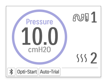
• With the small, 320 x 240 pixel display having already been selected, I started building a toolkit of ways to show information in a small amount of space. Early sketches included information-rich icons and data tiles that can fill the screen with information, but can be grasped at a glance.
Motion prototypes: Because of the small display, and the importance of motion transitions between screens, static wireframes were not communicative enough. I presented concepts in animated form, bringing the patient UX to life for early evaluation.
• I explored sliding screen transitions and enlarging menu tiles, as ways for a simple UI to expand to show more information when needed. I created these in Apple Keynote, and provided manually-advanced Quicktime movies for Philips to review.
• I developed a number of concepts for daily progress graphs and stats, to help the patient maintain commitment to therapy. Although my early concepts for this (below) were not pursued, the root idea stayed alive at Philips. The final product does feature a pair of goal progress screens (not pictured).
Clinician UX
Icon-based menu design: To allow respiratory therapists to view and edit numerous settings at once, we used icons to represent settings, letting us create high-density menus on a very small screen.
• As is common in home healthcare devices, we established a separate, keypress-protected user mode for the prescribing doctor or respiratory therapist. Unlike most CPAPs, however, we used a somewhat different menu navigation pattern, making the difference between the patient and clinician modes more clear, and better accommodating the speed and efficiency of expert users.
Patient-facing menu:
Clinician-facing menu:
• Parts of the patient UI are designed for the patient to interact with while being instructed over the phone by the respiratory therapist.
Visual Design & Client Support
• Style development: Following the new Philips visual brand guidelines as they developed, I explored the use of icons, color, type, and depth/flatness to communicate the UI design intent.
Click image for more:
• Process documentation: At a leading medical device manufacturer, the clarity of our design intent was particularly important. I needed to obtain the buy-in of a team of seasoned medical device developers, at each step. Documentation of alternative ideas was also important, so that Philips could return to a previously cancelled idea, if needed.
• Specification and image assets: Supporting the head UI software engineer, I created a lightweight but detailed visual specification document that can be referred to anytime the UI needs future expansion. I made a comprehensive set of image assets, working within device memory and compression constraints, and handed the in-house UI designers a package of Adobe Photoshop and Illustrator files that could be easily integrated into their asset library.
Results
As the new flagship CPAP device from Philips Healthcare, DreamStation is launching internationally, reaching a wide number of sleep apnea patients. Coupled with the related DreamMapper desktop and mobile apps, DreamStation is expected to help Philips' significant customer base grow much more comfortable and engaged with their treatment.


