Client: Gammill, Inc.
Organizing & energizing the quilt-making experience.
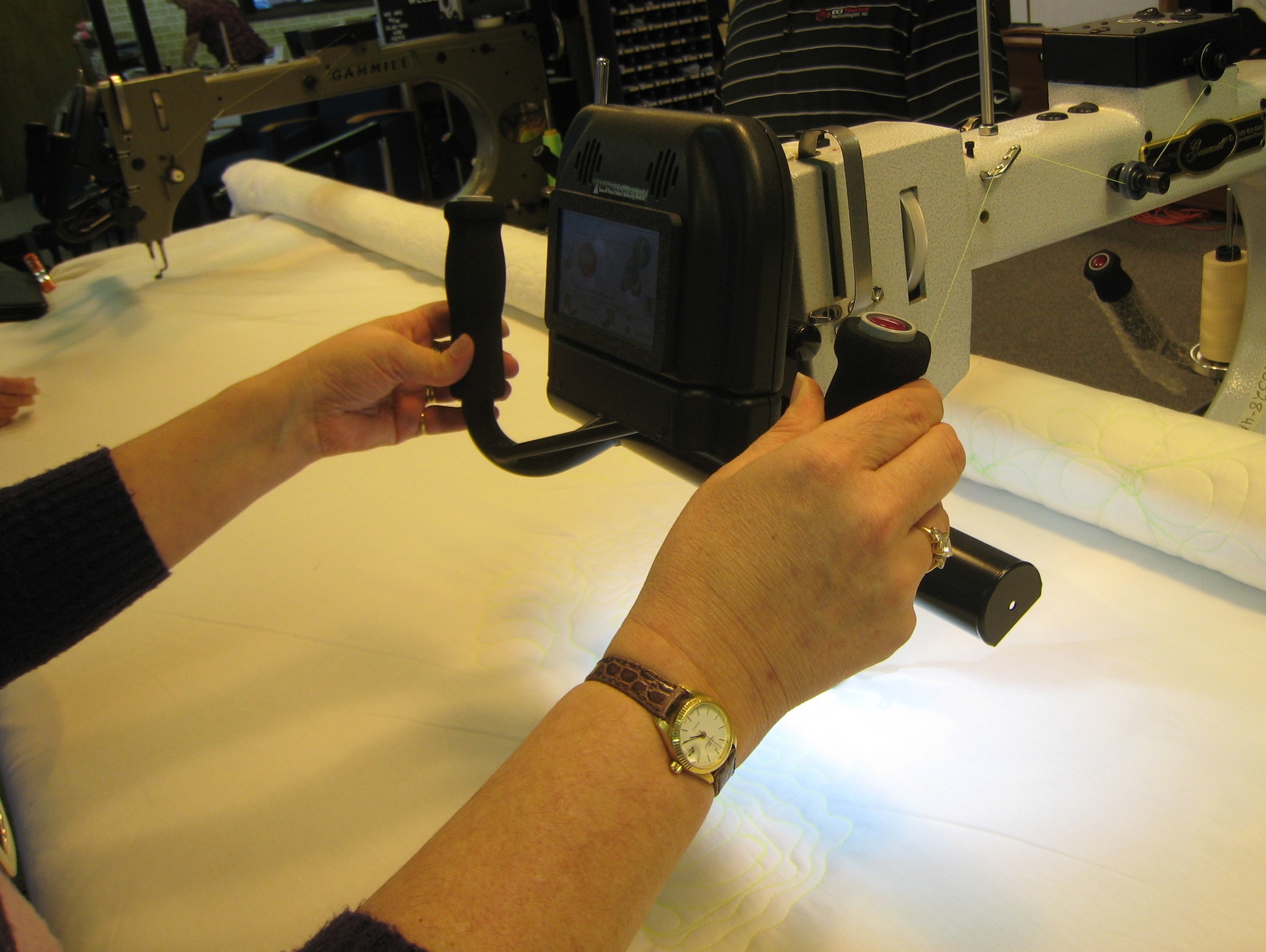
Vision 2.0 by Gammill is an Android tablet app that controls a hand-guided quilt sewing machine of the same name. It places key options at their fingertips in a well-structured Android tablet UI, allowing dedicated quilters—hobbyist, professional, and everywhere in between—to better control the nuances of quilt stitching.
Gammill, Inc. has a long-standing reputation of quality in hand-guided quilting machines, which are specialized sewing machines used to stitch patterns into quilts. As competitors embrace technology that improves quality and speed, Gammill sought to maintain its reputation and market lead, by introducing a completely new user experience for their hand-guided quilting machine.
Role
I led the user research, interface design, and visual design efforts, collaborating closely with client engineers and our software developer to create this Android tablet app.
Goals
Keep quilters in-touch with their creative process, by getting complicated controls out of the way and putting easy options at their fingertips.
• The existing UI for controlling a Gammill machine was a custom-built touchscreen unit, with a user interface that had many of its own, unique UI patterns, rather than patterns that tablet users would find familiar. It didn't present inviting calls-to-action for newer users.
• Invite quilters to take better care of their machines, by structuring the new app's settings and maintenance features around a user-centered mental model. The previous product followed a machine-centered model, and few quilters found or used these features.
Speak equally well to customers at both ends of the quilting market's broad age range, by using the best and simplest interactions that a touch-based tablet app can offer.
• Quilting is an industry rooted in tradition, with a divide between customers who are younger and older, tech-savvy and tech-averse. An easy, direct touchscreen UI can appeal to today's tablet users, and to traditional quilters not comfortable with older machines' controls.
• Introduce a visual design that Gammill can apply to future products, using rich color and tasteful icons to bring quilting control out of the engineering mindset, and into the bright style of the quilter's studio.
Process & Solutions
User Research: With the client's support, I set up a crash course in quilting, focused on gaining empathy for quilters and a clear understanding of their workflow.
• I planned an intensive research visit with two users: a quilting instructor who understands the needs of beginners and intermediates, and a show quilter with advanced technique and a sense of how to improve efficiency.
• With another designer, I devised an interview questionnaire and a think-aloud protocol, focused on learning different quilters’ goals, preferred processes, and what tends to get in the way.
• Across two days of think-aloud tasks and demonstrations of technique, we uncovered common frustrations and distractions of quilting, including usability issues with the current Gammill touchscreen UI.
Analysis: Working on-site immediately after the user research, we used affinity diagramming to clarify and communicate what we had learned about the quilting process for beginners, intermediates, and professional quilters.
• We grouped research notes and quotes along a timeline of the quilting process, rephrasing them into questions that quilters ask themselves at different points in a project: “Why am I creating this—for personal, sales, competitive, or teaching purposes?” “Is my pattern small and intricate, or large and sweeping?” “How fast can I stitch this pattern without making a mistake?”
• We merged these user questions into a decription of quilting with a Gammill quilting machine, finding the ways that Gammill's special sewing modes can help quilters achieve their goals.
• The result was a combination of a mental model of how quilters think about quilting, and a customer experience flow of using a Gammill machine to complete a quilt. This helped our client see quilting less through the lens of their engineering features, while helping us understand how to elevate those same features to meet real user needs.
Interaction Design: Identifying four concepts that needed extra attention, we focused on making these aspects clear, friendly, and immediately available to the user.
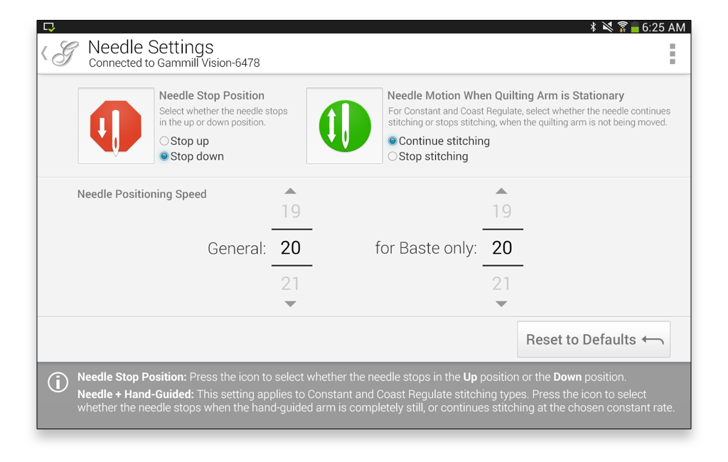
• Nimble sewing modes. Depending on the selected mode, the machine can stitch at a constant speed, stitch with constant distance between stitches, or in other ways. Each mode has settings to adjust. We found quilters were burning time and breaking their concentration, switching between modes and dialing settings up and down. Our tablet UI places the four sewing modes up-front, with the ability to switch with a single touch, and the detailed settings out in the open for immediate adjustment.
Click image for more:
• Understanding the “Coast Regulate” mode. This powerful feature lets a quilter sew large, sweeping shapes and small, tight patterns without stopping to change modes. Unfortunately, this subtle feature is difficult for users to pick up on. Our design makes it clear that Coast Regulate mode is a hybrid of the familiar Constant mode and Regulated mode. We made the "Switch Point", its most advanced setting, hidden by default, after learning that it can be set automatically for most users.
• Personalization. Gammill was interested in letting users save their own presets, and our research confirmed the value of this. After considering how expansive to make this feature, we focused down to two presets, tied to a pair of buttons on the main quilting screen. Leaning on conventions from clock radios and car stereos, we used a long press to save/overwrite each preset, and a short press to recall them on the fly.
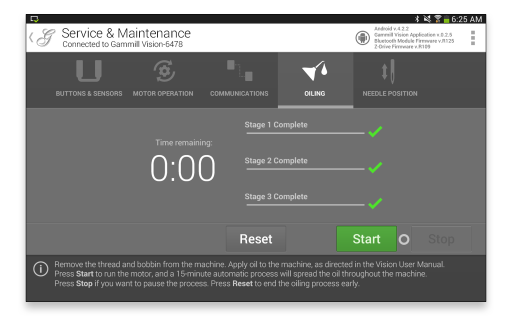
• Care and maintenance. The machine’s self-calibration, diagnostics, and maintenance features were originally structured around testing machines on the factory floor, giving an impression of “don’t try this at home”. We gave these features a single option in the app’s main menu, and icon-based navigation once inside the screen. This elevated these features to something end users could be comfortable thumbing through. We included help tips in a footer area, encouraging users to run the diagnostics at healthy time intervals. The restructuring also makes it easier for Gammill technicians to walk users through running these processes over the phone.
Click image for more:
Visual design
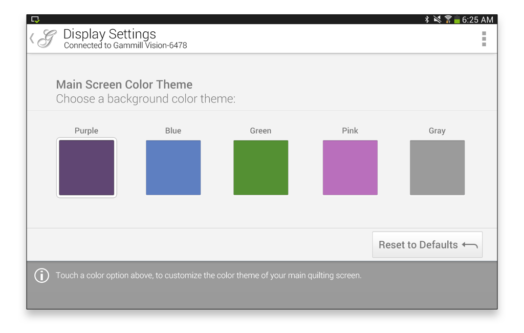
• Our goal was to make a statement that Gammill is upbeat, contemporary, and friendly to professional and hobbyist users. The main quilting screen brings a sense of depth and style, using rich background color, contrasting white panels, and simple, yet illustrative, icons.
• We sought to save effort and meet Google interface standards, by using stock Android UI elements where sensible. Working closely with our developer, I selectively applied Android conventions within an over-all design that strives for a unique, branded look.
• The visual design of the service and maintenance screens gives a hint of a “pro” or “technical” impression through its dark background and white type, while adding just enough bright color and iconography to guide novice users.
Outcomes
The new Android app modernizes the user experience of a product whose audience straddles a significant age gap, introducing a well-structured interface that is both familiar to the younger members of the modern quilt movement, and easy to learn for seasoned quilters who are less accustomed to technology.
I designed simple, flexible UI patterns and a visual style that are now being used as the basis for other products in Gammill’s line. In the process, I educated a successful, customer-focused company in UX principles and practices that can improve their valued customers’ experience with all Gammill products going forward.


